Today’s lesson in the Design Course from CodeWithChris looks at how we can create custom styles for our buttons.
Once again, I enjoyed playing around with the design options for this. That’s been the delight of this Design Course for me – after the heavyweight coding tutorials of the iOS Foundations course, I think I needed something a little lighter.
For the most part, the design aspect is quite logical so long as you can visualise what it is that you want to create. I’d imagine a design / graphics package in which you’d sketch up your initial design would be advantageous here. I suspect we’ll get to that at some point.
That said, having to deal with the foibles of Xcode / SwiftUI, as mentioned previously, is not always the smooth and seamless experience we could ask for.
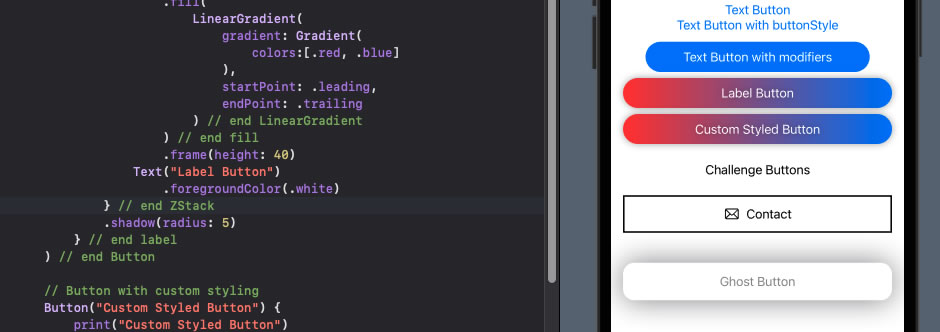
For future reference, creating a struct / method for a reusable button style goes something like as follows.
You’d place the custom style method in your ContentView, thus:
Button("Label for Button") {
    // some action
}           .buttonStyle(CustomButtonStyle())
And your button style method would be in a struct like this:
struct CustomButtonStyle: ButtonStyle {
    func makeBody(configuration: Configuration) -> some View {
        ZStack {
            Capsule()
                .fill(...)
                .frame(height: 40)
            configuration.label
                .foregroundColor(.white)
        }
        .shadow(radius: 5)
        .opacity(configuration.isPressed ? 0.8 : 1)
        .scaleEffect(configuration.isPressed ? 0.96 : 1)
    }
}
I’ve highlighted a couple of key elements there, where configuration is the controlling parameter which can be used to get the label text from the Button, or detect when the button has been pressed.

