
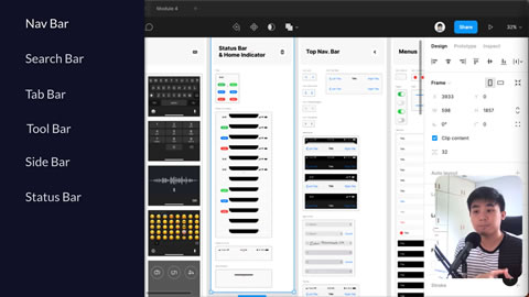
Lesson 3 from Module 4 of the CWC+ Design Course sees us guided throught the essential elements of the various types of bars used for interfacing with our apps.
- Navigation Bar
- At the top of each screen, with minimal elements such as a “back” link, a title, and a control, such as “save”, for the current screen.
- Search Bar
- At the top of the screen with a search box, possible microphone button for voice search, and, if necessary, a ‘cancel’ option.
- Tab Bar
- A navigation aid at the bottom of the screen allowing the user to switch between areas of the app.
- Tool Bar
- A bar at the bottom of the screen containing tools for interacting with the currently displayed screen.
- Side Bar
- Containing other elements, possibly more useful with larger screens / iPads as it takes up more space.
- Status Bar
- The bar at the top of the screen showing the time, battery, wifi, etc, which may conflict with the design if the background is left transparent.
These are elements that we’re all “aware” of, having used apps ourselves, but it’s not until JC takes us through them from an app designer / developer’s perspective that you realise just how much thought and coding needs to go into these elements. How little we, as users, are aware of!
Remember that there are six principles to the iOS design system: Aesthetic Integrity, Consistency, Direct Manipulation, Feedback, Metaphors, and User Control, re: https://developer.apple.com/design/human-interface-guidelines/ios/overview/themes/


