Having created the basic guts of my app, using Core Data, and some back-end work, using PHP/MariaDB to generate a JSON file that populates the app, the next stage is to start laying out some screens / views in the app for UX (User Experience).
Menu System
In looking at layout, my first consideration was navigation. I wanted to use the traditional tab bar at the bottom of the screen, but with custom icons representing the key areas of the app. I want to try and keep all key controls / buttons at the bottom of the screen, but with my own indicative icons / images, so that they are easier to reach with the user’s thumb.
The one thing I discovered was how difficult it is to change the standard tab bar. Your only real option here is to eschew the built-in tab bar and create a custom one. In discovering this, I came across this website – How to create a custom Tab Bar in SwiftUI – which breaks down the code required into incredibly intuitive steps.

I loved the way it gives focus to a primary, larger, central button but, even more than that, the site shows how to code “pop out” buttons from that central button. A “pop out” system enables you to have the main buttons available to the user’s thumb without taking up too much valuable screen real estate.
This site gave me in the incentive to incorporate my own creativity, and I wondered if I could do something better than the “tab bar with central button” design.
With a little modification to the code, I was able to create a corner menu button. This enables me to clear any less significant buttons from the bottom of a particular view but still have key buttons available across the app, while freeing up space that would be taken up by the tab bar.
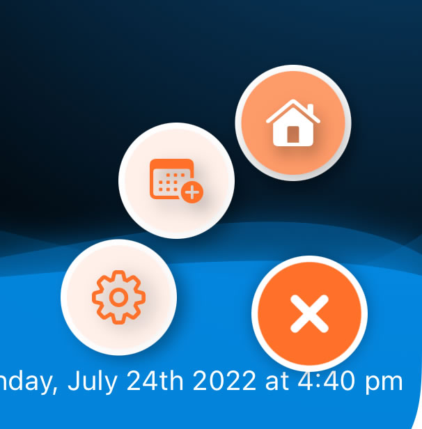
After working on the code for the corner menu button, I then wanted to look again at custom icons for the buttons. Right now, that’s a little bit on hold because I don’t want to load in too many assets to achieve a button icon. So, for now, I’ve limited myself to three key buttons – ‘Home’, ‘Settings’, and ‘Calendar’ – the latter of which will be for adding entries to days, and to handle all the other primary interaction. There may be an additional button later but, now that I’ve written the code, it won’t be a bit leap to customise it further.
Logo Design
One of the things I feel the app design needed is a logo, or at least some familiar icons to visual what the app is all about. I hunted around for various images, photos, icons, across the internet and many different asset / resource websites.
The one thing I discovered is that you’re not really going to find much for free. Most sites ask you to pay an ongoing monthly fee / subscription – which isn’t ideal if you only want a handful of initial icons or designs. Free images tend to be simplistic, single colour, and require attribution. I don’t mind attribution, and encourage it, but I don’t want my app littered with attributions for every single asset.
Ultimately, after spending several days hunting for the relevant images, I decided on a different approach. My art skills are pretty much non-existent, but I figured I might have a go drawing some assets myself.
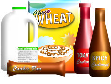
What I wanted at this stage was some generic food products of the type that people might keep in their pantry or cupboard. Breakfast cereal, milk, biscuits, condiments, that kind of thing. Other than my “biscuits” turning out to look more like the world’s largest candy bar, I think I did okay for a raw newbie.
The software I used was Serif Affinity Designer. The most helpful feature for this design is that Affinity enables you to make images ‘3D’ fairly easily. Mostly the images I’ve created are a collection of rectangles and ellipises (my years of CAD not going to waste here!), but with the 3D effect added over gradients.
The image could do with more tweaking but, I think, for a first effort and to give the app something visual to display, I think it works.
Screen Layouts
My next step is working on screen layouts, how to present the data in visually-pleasing and easily accessible ways.
To this end, I’m using Serif Affinity Publisher (together with Designer) to create some layouts and to see how they might look. I’m clearly not the most design-centric person but, I feel, by playing around with the designs here before creating the code for those layouts, I’ll get a better understanding of what might work.
I’ll post about how I progress next time…


