The final series of lessons in this course covers using blurs and shapes to create effective backgrounds.
As I take a moment to look back over this course, I feel that I’m much more confident with ‘Views’ than I was before. Although ‘Views’ are fairly straightforward in terms of logic, getting your head around that logic in the first place is key. Thanks to Mark Moekens from Big Mountain Studio taking us through many options and modifiers and ‘views’ in bitesize chunks, I feel more of it has sunk in than had before.
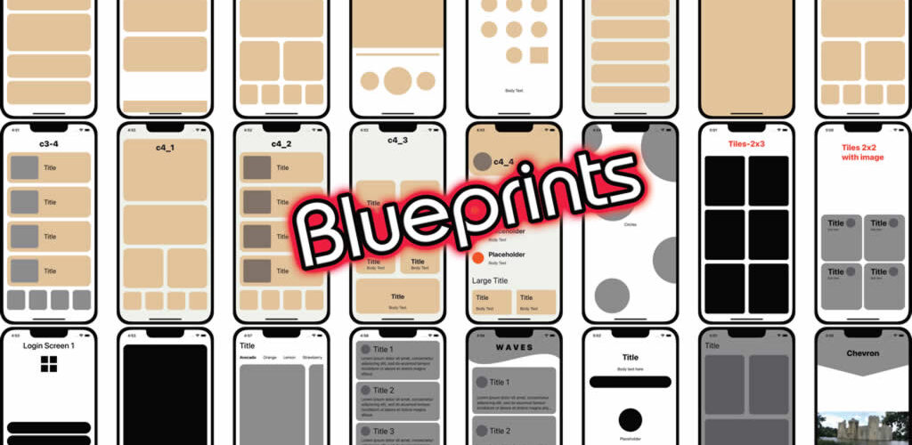
Best of all, by the end of the course, we’ve built up quite a collection of blueprints and designs.
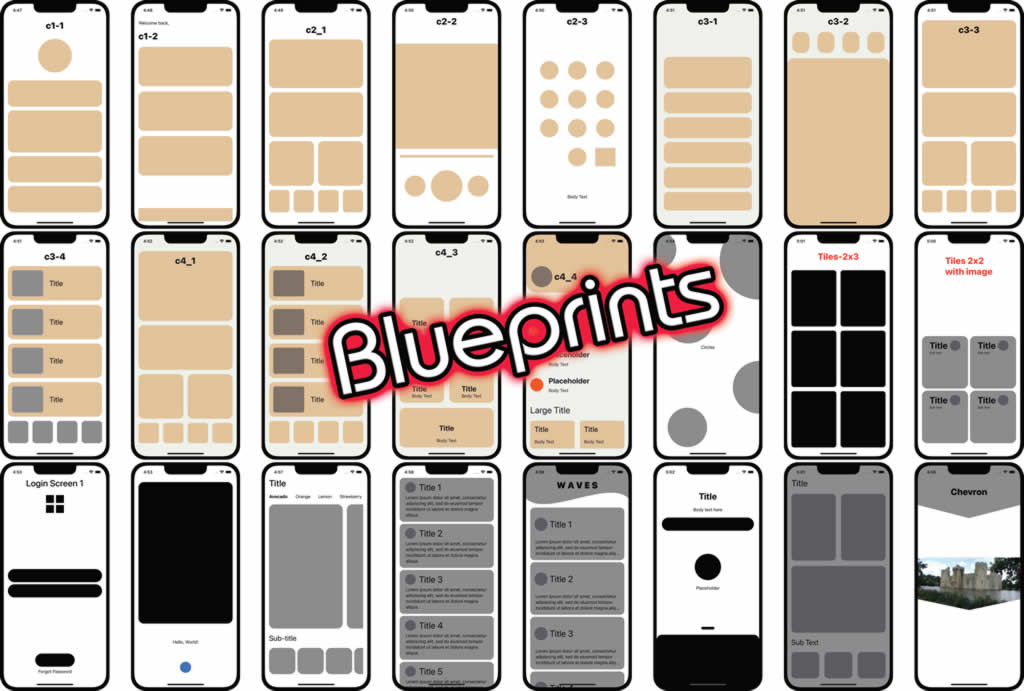
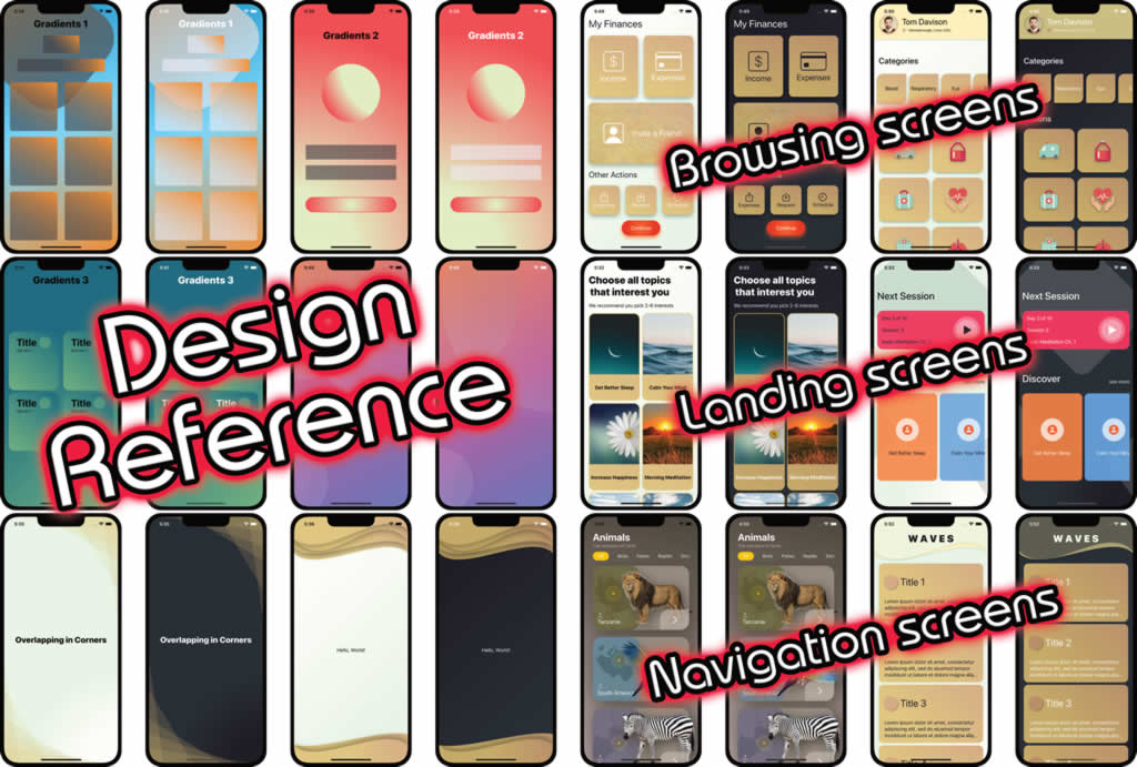
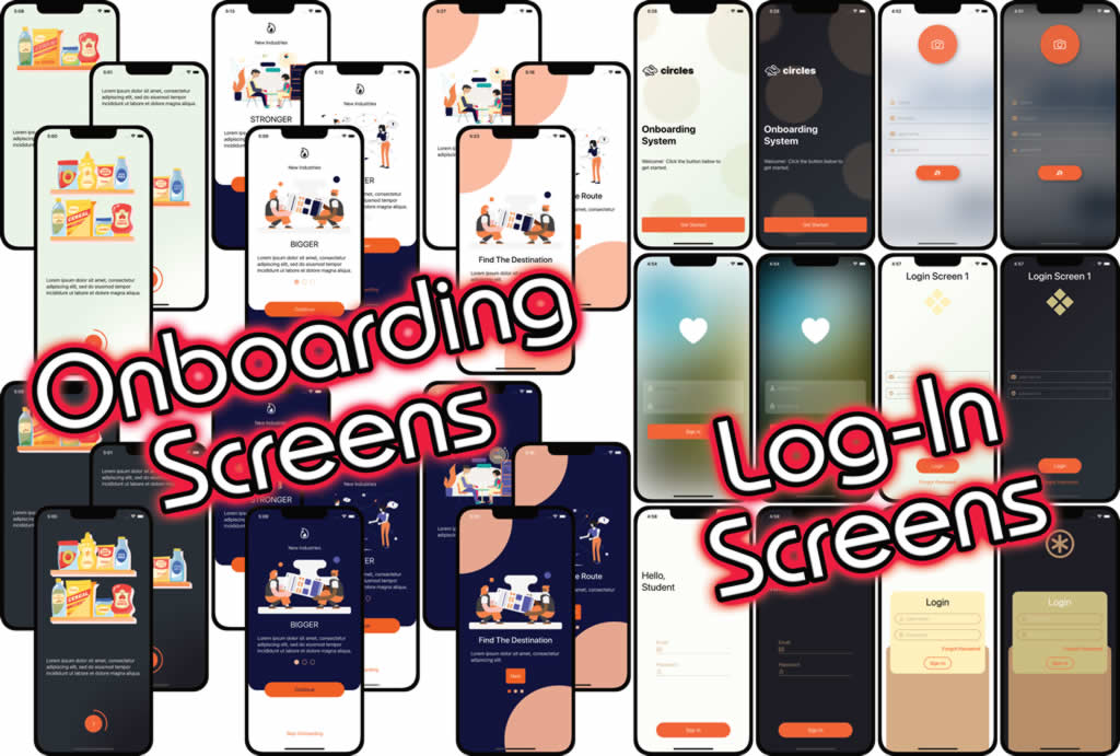
None of these are intended to be the “finished product”, nor a rigid design. They’re intended to be a starting point from which creative ideas and designs might spring.
By having something already set up, it’s easier to move into coding logic for the app without having to start the design from scratch.
It’s been a rewarding couple of weeks, and I can’t wait to begin my next course.

