Okay, so it’s been about ten days since my previous blog entry, but I’ve not been slacking. In fact, I’ve been working through the first 12 of 13 lessons from the SwiftUI Views Specialist Course, a course from Big Mountain Studio that’s now a part of CodeWithChris CWC+ package.
In this course, Mark Moeykens from Big Mountain Studio takes us through many lessons including Shapes & Text, Vertical Stacks and Spacers, Horizontal Stacks, Depth Stacks, Layers, Gradients, ScrollViews, and more.
Some of this is covered by Chris in the CWC+ iOS Foundations and Design courses, but Mark presents his lessons in lots of “bite-sized chunks”. It’s a bit like reading a book, with scene ends and chapter points, making the whole learning experience easier to digest.
By it’s title, this course is only for designing. There’s no interactive code, or database manipulation, or buttons, Navigation bars, or any of that. And that’s good, because this course covers a lot of aesthetics and, before you know it, you’ve actually learned more than you thought you did.
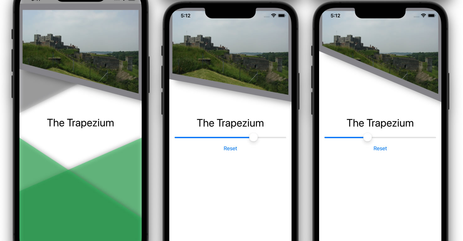
Mark’s approach is to guide the viewer through building up two primary design libraries. There’s the “blueprint” library, which consists of greyscale layout view screens with minimal code; and then there’s the “portfolio” library, which leaves us with a whole host of different design ideas.
The purpose is that, when we go on to creating our own apps, we won’t get too bogged down with the design because we’ll already have a bunch of handy blueprints to work from and portfolios to build on. Separating design from code as much as is possible.
Most of the lesson sections ends with a “challenge”. The original idea appears to be for the viewer to post their challenge results to a forum, at which point they’ll be provided with an “unlock” key and receive rewards. As part of CWC+, however, the rewards are provided without submission of challenge attempts. This is a good thing in many respects, because a lot of the early lessons are things we’ve covered already and I admit that I didn’t dwell on the challenges.
That said, when we reach the penultimate lesson, Mark presents us with the challenge of all challenges – to bring together everything we’ve done so far and create a “complex” design screen. I quote the “complex” because it only looks complex. When you start working on it, it quickly becomes apparent that Mark has taught us all that we need to know. So long as we take the design step by step, it’s relatively easy – albeit a little time consuming.
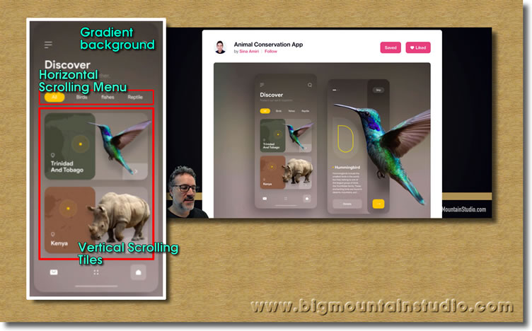
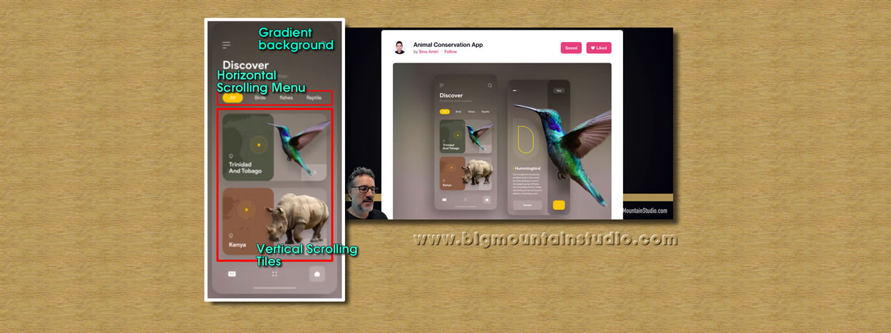
Mark selects a screen that uses gradients, a horizontal scrolling menu, and a vertical scrolling menu with complicated tiles.
Although Mark recommends using our own prefered colour theme, I wanted to leave that for another time and instead focus on building the screen he provides as an example.

The finished result relies on an awful lot of layering, as can be imagined by the tile panels themselves. There’s the gradient background, there’s the title and sub-title in its own VStack, the horizontal scrolling menu using a ScrollView and HStack (within which is a ForEach taking text elements from an array) complete with a RoundedRectangle for the highlighted menu element, and then there’s the tiles.
The panels are in a ScrollView of their own, and after creating the first panel I extracted it into its own view so that I could call each panel easily within the code. The panel itself is a whole bunch of ZStacks, HStacks, VStacks, and Spacers, all to line everything up in the right places.
The map image is overlaid with a coloured RoundedRectangle with opacity set to make it partially transparent. The image of the animal is offset slightly so that it exceeds the width of the main RoundedRectangle, and both it and the main RoundedRectangle are shadowed.
The country text comes with an SF Symbol map pin, and the yellow location highlight is three circles laid on top of each other at various levels of opacity.
Finally, the topmost “layer” is the rectangle in the bottom-right which has just two rounded corners, courtesy of one Mark’s ‘shape building’ lessons. That, too, has its opacity set so that you can see the animal beneath it.
To complete the effect, I used layers so that the panels would go under the title & menu when scrolled (something else Mark teaches us).
I could spend some time working on other tweaks on this, but there’s a danger in getting too tied up in the details when the purpose of the lesson is to explore what we’ve been taught up to this point. In that, I’d have to say that it’s been a big success.
Credits:
Resources used in my version: ‘Male Lion’ sourced from prussiaart; Zebra’ & ‘Parrot’ image sourced from sarthony; background ‘Map’ image(s) designed by Freepik.
Original layout design used in this lesson from Sina Amiri.
If I missed any credits, get in touch and I’ll add them here.


