Continuing on the previous video guide, JC guides us through almost 40 minutes for Lesson 3 from Module 3 of the CWC+ Design Course.
As before, this is less like the lessons we’ve had previously with Chris and more “watch and listen” without any real interaction. I tried to follow some of what JC did in the video and even, very reluctantly, installed the plugins when he relied on them again later in the video. I would like to know what the “potential risks” that we entail by installing these plugins, but this isn’t mentioned at all. It does seem, however, that Figma is massively reliant on “community plugins” so, if you decide to use Figma as is being shown here, you’re going to have to accept any “potential risks” whether or not you know what they are.
JC relies on a plugin called Icons8, but there was no such plugin that I could find on Figma. The nearest one I could find is calld Icons 8 – icons, illustrations, photos so I’m presuming (hoping) that it’s just had a name change. It’s free for limited usage (you don’t get the SVG versions without paying), and you must link to Icons8.com wherever the image is used. It does appear that, if you go to the Icons8.com website, there is a link on the first page for “Icons8 Figma plugin”. This takes you to a page with a button to “Install Icons8 plugin” which, in turn, links you back to the Icons8 – icons, illustrations, photos page on Figma (which tells me I’ve already installed it, so it clearly IS the same one that JC is using). Phew, that was a bit “around the houses”.
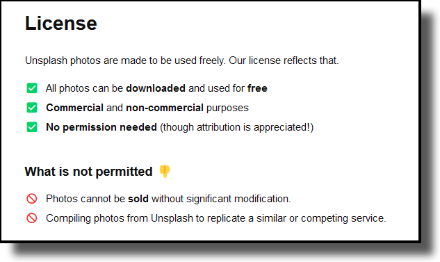
Also demonstrated in the video is the plugin Unsplash, a stock photo plugin. It’s not immediately obvious whether the images from Unsplash are “free to use” but, if you hunt around their website, you’ll find a license page which reassuringly states:
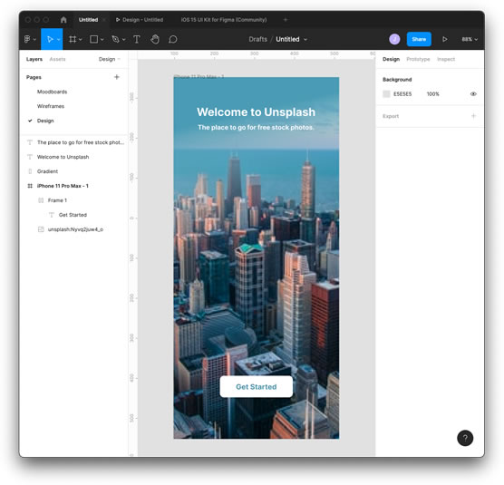
Later, JC talks about something called iOS 14 UI Kit for Figma, which I originally took to mean something to do with UIKit (the older version of Swift UI), but it turns out not to be that. It contains lots of iOS elements that can be used in your Figma project to save having to draw them up yourself. This seems fine, but it doesn’t come up in a search of the plugins, so there’s no indication of where you’d get this from1.
Searching the internet for “ios 15 ui kit for figma” (as we’re on iOS15 now), brought up a result that sends us to Figma‘s website : https://www.figma.com/community/file/984106517828363349/iOS-15-UI-Kit-for-Figma. The only button on the page is “Duplicate” (not “Install”), and clicking that seemed to open up “something” in Figma – a file that appears to contain each of those elements.
It’s all a bit confusing for a newbie.
One of the aspects I did find illuminating was the concept of a Component. Creating a component links copies of element groups together so that, when you change (resize, for example) the original component, all of the linked components change to reflect this. So if, for example, you have a prefered design of a button and you use the same button on multiple screens and later decide you want to change the size or colour of that button, you only have to change the one for all such buttons to mimic the change. I can see that being very handy.
Towards the end of the video, JC gives us some design tips to bear in mind when we’re creating our own projects:
- Headline text should be along the lines of Medium, 20-34pt
- Regular text should be 11-19pt, 0% letter spacing, 120% line spacing
- Multiple lines should be limited to 45 characters per line
- Use complementary colours (opposite colours on the colour wheel)
- The 60-30-10 Colour Rule.
This final rule was a new one on me (it was probably called something else in the past), but your main colour should be approximately 60% of the design (say, the background and predominant colour), your secondary colour should be 30% of the design (perhaps the text and outlines), and the final 10% should be for accent colours (an eye-catching element in a contrast colour, perhaps).
This 40-minute video covers a lot of information, and I doubt that much of it will be retained. As an overview/advert of how powerful Figma is and what it’s capable of, it’s definitely pretty awesome. I think that Figma is going to be one of those tools that you “learn by doing”.
Notes:
1 Amusingly, it turns out that a link to this file is offered in the next section – Lesson 1 of Module 4 of the Design Course.


