
With lesson 5 of module 6 from the CWC+ Design Course, we’re back to App creation/coding as Chris refreshes our memory on how to add custom fonts to a new iOS App project, as well as creating custom colours.
The lesson also covers taking image assets from the prototype design in Figma into the app, and checking for design colours and other aspects.
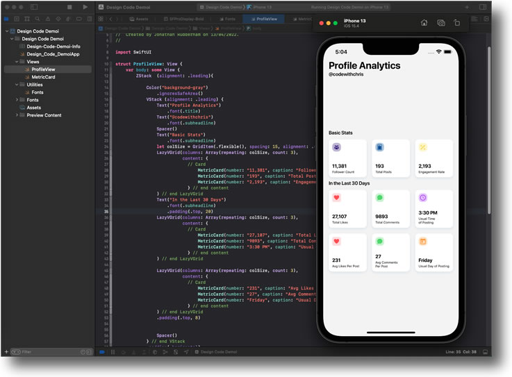
In lesson 6, we start to build the preview screen, constantly referencing the Figma prototype to check on dimensions, colours, fonts, etc.
Figma tip:
Select an element, then press ALT whilst moving your cursor over other elements to have Figma show how far apart the elements are.
Much easier than checking out the X,Y coordinates and calculating it.
Lesson 7 sees us encounter another in Xcode‘s long line of “let’s change things to confuse people” policy.
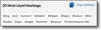
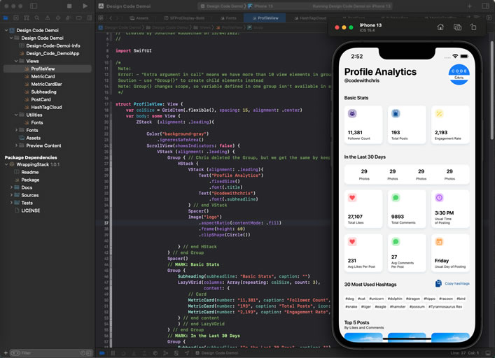
We need to add a “package dependency”, something we’ve never done before, in order to accomodate the fact that SwiftUI doesn’t have a facility for variable sized cells in a grid. By that I mean we need to achieve something like the image here, whereby the columns are not uniform in width yet the space is optimised for reduced waste.
In order to achieve this, we take advantage of someone else’s handiwork, which can be found here: diniska‘s SwiftUI Wrapping Stack.
According to the version of Xcode used in the tutorial, we just need to follow the instructions and to add the new package dependency from the menu option that Chris takes us to:
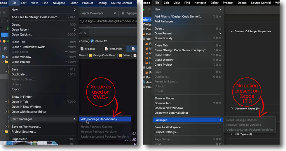
In Xcode 13.3, that option is missing. Admittedly, this time it didn’t take a huge amount of hunting around to find it, but it does make me wonder why Apple felt the need to move it in the first place. The previous option seemed perfectly sensible to me.
Anyway, if you still can’t see it, the option is here:
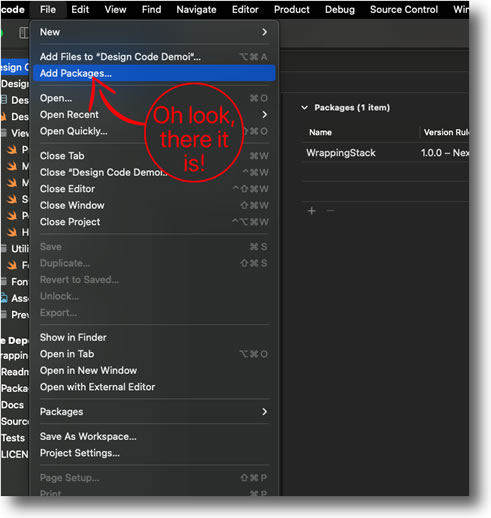
We can then continue following Chris’ tutorial. The dialogue boxes to add the new package are also a little different from those shown in the tutorial, but it doesn’t require too much head-scratching to figure it out.
This is our code utilising the new wrapping HStack:
import WrappingStackstruct HashTagCloud: View {
let tags = ["dog", "cat", "unicorn", "dolphin", "dragon", "hippo", "racoon", "bird" , "snake", "tiger", "eagle", "hamster", "possum", "Tyrannosaurus Rex"]
var body: some View {
WrappingHStack (id: \.self, alignment: .leading, horizontalSpacing: 5, verticalSpacing: 5) {
ForEach (tags, id: \.self) { tag in
Text("#\(tag)")
.padding(3)
.background(.white)
.font(.caption)
.cornerRadius(5)
}
}
}
}
This lesson concludes the CWC+ Design Course. We’ve come a long way, from starting out creating our own shapes and gradients, to looking at Grids, Lists, Cards, and Forms, through iOS Design Guidelines, and using Figma to create the App Design from Journey Map to Prototyping, and finally migrating the design to a layout in Xcode using SwiftUI.
Next up, it’s time to get the brain switch to high gear and dive into iOS Databases (SwiftUI). Should be very enlightening.


