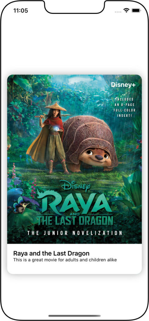
A common design convention in apps is the use of “cards” – those layouts that slide on the screen, looking almost three dimensional, over the top of that which it covers.

We’ve used a card in an app during the iOS Foundations course from CodeWithChris, and Lesson 3 of Module 2 from the Design Course takes us through designing one with all the appropriate elements.
Put everything in a GeometryReader so that we position elements relative to our design and not have to rely on pixel positioning:
var body: some View {
    GeometryReader { geo in
        ...
    }
    .frame(height: 500)
}
As we’ll be layering elements on the card, we wrap the design in a ZStack:
   ---
        ZStack {
            ...
        }
        .cornerRadius(15)
        .shadow(radius: 10)
        .padding()
    ---
Inside the ZStack we have the Image(), and we also have a gradient Circle() to help highlight the “Disney+” text at the top-right of the image. The final “layer” in the ZStack is a VStack within which we align all the text:
---
    Image("raya")
        .resizable()
        .scaledToFill()
        .offset(x: 0, y: -80)
    Circle()
         .fill(
            LinearGradient(
                gradient: Gradient(
                    colors: [
                        .blue,
                        transparentColor
                    ]
                ),
                startPoint: .top,
                endPoint: .bottom
            )
        )
        .frame(width:170, height:170)
        .offset(x: (geo.size.width-40)/2 - 20, y: -(geo.size.height)/2 - 40)
    VStack{
        ...
    }
---
For a reminder of how to get the transparency in the gradient colour, click here.
Our text VStack would be something like this:
---
    HStack {
        Spacer()
            Text ("Disney+")
                .foregroundColor(.white)
                .fontWeight(.bold)
        }
        .padding([.top, .leading, .trailing])
        Spacer()
        ZStack(alignment: .leading) {
            Rectangle()
                .foregroundColor(.white)
                .frame(height: 80)
            VStack (alignment: .leading) {
                Text("Raya and the Last Dragon")
                    .font(.headline)
                Text("This is a great movie for adults and children alike")
                    .font(.caption)
            }
           .padding([.leading, .bottom, .trailing])
        }
    }
---


