On the CWC+ website, a course called Working with SwiftUI Shapes is, apparently, another name for the The SwiftUI Shapes Live Series from Mark Moeykens from Big Mountain Studio.
If you’ve been following my recent blog entries, you’ll already know that I’ve quickly become a big Mark Moeykens fan. His easy-going, laid back, presentation style is friendly and not at all stressful.

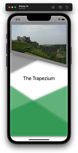
The first “lesson” in this course focuses on the trapezium – a four-sided shape used to demonstrate how we can create a flexible shape and use it for our own projects.
The SwiftUI Shapes Live Series isn’t necessarily what it sounds like. The “Live Series” aspect is key. It seems that Mark originally presented this series on a video platform with two-way input between him and his viewers. That’s pretty much not possible when watching the videos on CWC+. Instead, the 72 minute video is split into 6-15 minute chunks focusing on specific aspects of the lesson.
The full 72 minute video is also available after these chunks if you want to watch it all the way through, and the finished project is provided if you need it.
The first series of “chunks” deals with creating a trapezium shape with flexible corners.
It’s not just that, however. Part of the video brings new concepts and ideas on board – including animation, something I haven’t seen explored so far in my learning.
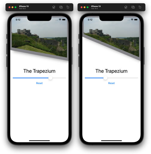
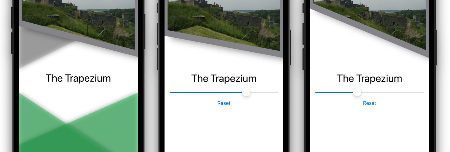
The animation demonstrated includes a Slider() control that enables the app user to affect the shape on the screen, and also an automated animation for when the view first appears. It’s amazing that these things can be achieved with just a few lines of code.
Slider(value: $offset, in: 0.1...1)It’s that simple to have a slider control displayed on-screen, with the value (in increments from 0.1 to 1, in this example) sent to the @State variable offset. The @State variable, if incorporated into a property of the path (trapezium in our example), can vary the shape as the user moves the slider.

Even though these are not necessarily practical examples of what we will use in our code, it gives us a sneak peek into what is possible in SwiftUI.
I began my journey into App Development having used apps, but knowing nothing about how to create them. The whole thing seemed like some arcane magic that required years of knowledge and experience (as daft as that sounds – Swift has only been around for developers since 2014, and it changes frequently – requiring everyone to keep up with those changes, so no one is really an “expert” at any one time).
Animations had, likewise, seemed like some arcane mystical stuff. Just how do apps on the Apple AppStore do those fancy things? If this peek through the crack in the door of SwiftUI animation is anything to go by, it’s probably not quite as arcane as I feared.
I can’t wait to see what Mark has in store for us next.


